
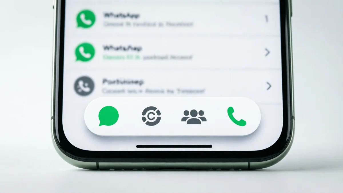

If you use WhatsApp on Android, you have probably noticed the app changing a lot lately. Meta is currently testing a major overhaul to the bottom navigation bar, and they are moving fast.
Just last week, the company introduced a “floating” menu design in the Android beta. Now, only a few days later, they are already testing a second variation. This time, they took out the text labels completely.
Here is a straightforward look at what this new menu looks like, why WhatsApp is making these changes, and when you might actually get it on your phone.
Quick Facts: The New WhatsApp Bottom Navigation Bar Android
- Feature: Redesigned bottom navigation bar
- Current Status: Under development (Beta testing only)
- Latest Beta Version: 2.26.39.10 for Android
- Main Change: Floating design with rounded corners and no text labels
The First Change: A Floating Menu
To understand this new update, you have to look at what happened last week. In the WhatsApp beta for Android (version 2.26.38.10), the bottom menu stopped sitting flat against the edge of the screen. Instead, it “floated” slightly above your chat list and got rounded corners. It was a big shift that made the Android app look a lot more like the iPhone version.
But the developers did not stop there. In the very next beta release (version 2.26.39.10), they stripped away the text. The words “Chats,” “Updates,” “Communities,” and “Calls” are gone. You just get the four symbols.
Because the text is gone, the menu actually looks a bit wider. The app reduced the blank space (padding) on the left and right sides, stretching the bar closer to the edges of your screen. Both light mode and dark mode look noticeably cleaner without the extra words.
Why is WhatsApp Removing the Text Labels?
You might wonder why a company would remove words that tell you what a button does. It comes down to keeping the app simple.
1. Less Visual Clutter: Modern apps want to feel “light.” By removing the text, the bottom bar feels less heavy and takes up less mental space when you are scrolling through a busy group chat.
2. Everyone Already Knows the Icons: Think about it: the speech bubble for Chats and the phone receiver for Calls are universally understood. Unless you are opening WhatsApp for the very first time today, you do not need a label to tell you which button opens your messages.
3. More Room for Your Chats: Every pixel counts on a phone screen. A compact, icon-only menu frees up vertical space, giving you a slightly better view of your actual conversations.
Is This Update Available to Everyone?
No, not yet. Right now, this new bottom navigation bar is strictly in the testing phase. It is not available on the standard version of WhatsApp you download from the Google Play Store.
Even if you are a beta tester, you might not see it right away. WhatsApp often tests different designs on different groups of people to see which one works best.
Furthermore, this is not the final design. The developers are still refining it. They might change the size of the icons, adjust the colors, or even bring the text labels back before the update goes live to the public.
How to Try the New Menu Right Now
If you want to see the new label-free menu for yourself in WhatsApp, you need to be part of the testing program.
- Open the Google Play Store on your Android phone.
- Search for “WhatsApp” and scroll down to the “Join the beta” section.
- If spots are open, tap Become a Tester.
- Wait for the app to update to version 2.26.39.10 or higher.
Note: Beta programs fill up very quickly. If you cannot join right now, you will just have to wait for the stable update to roll out to everyone later this year.
Conclusion
WhatsApp is clearly trying to modernize its Android interface. The shift toward a floating, minimalist bottom bar makes the app feel much more current. Whether the text labels stay or go in the final version remains to be seen, but the direction the app is heading is obvious: cleaner lines and less clutter.
Are you a beta tester? Let us know in the comments if you prefer the new icon-only menu or if you miss the text labels!
